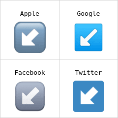
左下箭头 表情符号
Four-panel comparison labeled Apple, Google, Facebook, and Twitter, each with a white arrow pointing down-left in slightly different icon styles, poking fun at inconsistent arrow designs across brands.
Good for
- when mocking inconsistent icon designs
- sharing UI detail differences in a group chat
- illustrating a design comparison post
Collected from the web · rights belong to the original authorsWeb
- License
- Web collected
- Source
- cn.piliapp.com
- Details
- 240×240 · PNG
Tags
Writing something? Let AI place memes
Paste an article and memes land on the punchlines.


 Works with Claude Code, Codex, Cursor, ChatGPT and 19+ more AI tools→