Why Google Why
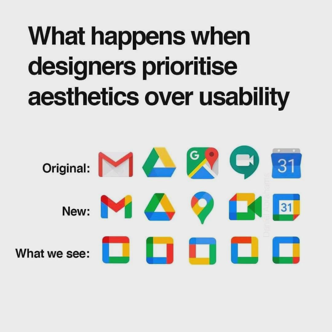
A meme mocking Google's icon redesign: the caption asks what happens when designers prioritize aesthetics over usability, showing old and new Gmail, Drive, Maps, Meet and Calendar icons, while the bottom row 'what we see' turns them all into identical colorful squares, conveying confusion and sarcasm.
Text in the image
“当设计师把美观置于可用性之上会怎样” “我们看到的”
Good for
- complaining about a confusing app redesign
- when coworkers can't tell new icons apart
- debating aesthetics versus usability in design
Collected from the web · rights belong to the original authorsWeb
- License
- Web collected
- Source
- programmerhumor.io
- Details
- 1080×1080 · JPG
Tags
Writing something? Let AI place memes
Paste an article and memes land on the punchlines.


 Works with Claude Code, Codex, Cursor, ChatGPT and 19+ more AI tools→