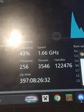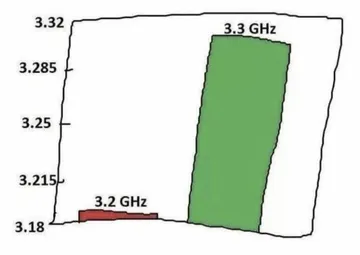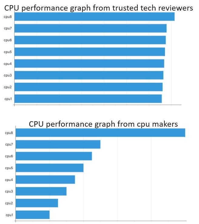
Understanding Graph Axis Is Important: CPU performance graph from cpu makers,
Two bar charts comparing CPU performance: the top one, labeled "CPU performance graph from trusted tech reviewers," shows nearly identical bars for cpu1 through cpu8; the bottom one, labeled "CPU performance graph from cpu makers," shows bars increasing sharply from cpu1 to cpu8. Suitable for mocking biased benchmarks, vendor hype, and double standards.
Text in the image
“CPU performance graph from cpu makers”
Good for
- mocking inflated vendor benchmarks
- reacting to a double-standard chart
- calling out someone bragging about scores
Collected from the web · rights belong to the original authorsWeb
- License
- Web collected
- Source
- programmerhumor.io
- Details
- 656×741 · JPG
Tags
Writing something? Let AI place memes
Paste an article and memes land on the punchlines.


 Works with Claude Code, Codex, Cursor, ChatGPT and 19+ more AI tools→