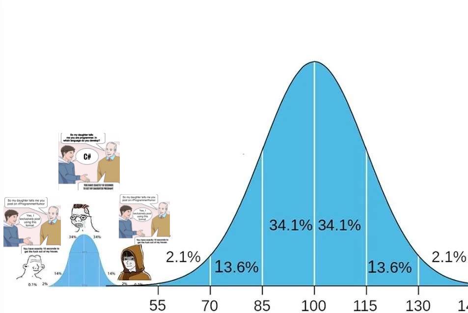
The Bell Curve Of Programming Language Drama
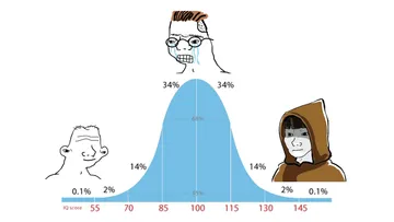
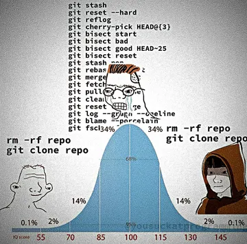
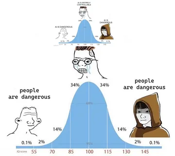
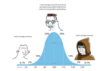
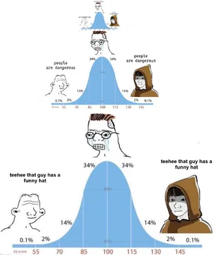
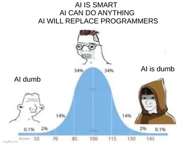
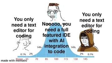
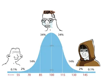
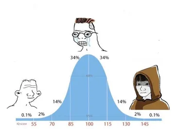
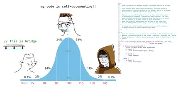
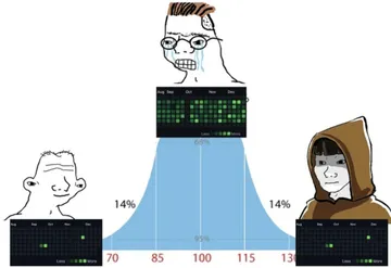
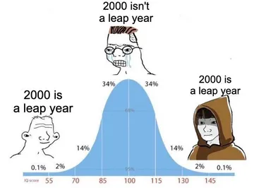
A blue bell curve chart with a horizontal axis marked 55 to 130 and percentages like 34.1%, 13.6%, and 2.1% inside the curve. Small cartoon figures sit at both tails, with an ordinary programmer in the middle. Useful for normal distribution, polarization, statistics jokes, or mocking extreme opinions.
Good for
- when online opinions split into extremes
- explaining most people are average
- mocking programmer community drama
Collected from the web · rights belong to the original authorsWeb
- License
- Web collected
- Source
- programmerhumor.io
- Details
- 953×638 · JPG
Tags
Writing something? Let AI place memes
Paste an article and memes land on the punchlines.


 Works with Claude Code, Codex, Cursor, ChatGPT and 19+ more AI tools→